Project Overview
Bottlecap Brokers was a proposed real estate brokerage built around a genuinely interesting niche — brewery and beer industry properties, launched at the height of Portland's craft beer boom. The brief came from two real clients with real enthusiasm for the market, and grew from an initial web design commission into a broader identity and brand presence project.
The venture didn't outlast the boom it was built for. But the brief was real, the thinking was sound, and when it came time to include this work in a current portfolio it deserved to be rebuilt to current standards rather than preserved as a period piece. The target was professional but approachable — corporate enough for a real estate context, loose enough to feel at home in a taproom.
Website
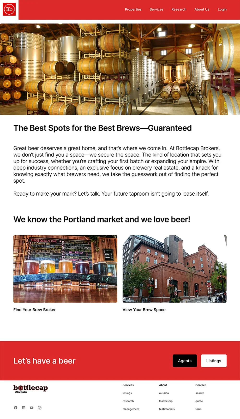
The website was the original commission and the primary canvas for the brand. The design borrows from corporate real estate for structure and credibility, but the imagery, language, and energy are closer to the industry it was built to serve. Three pages are shown:
A home page anchored by Portland brewery imagery and the brand's mission statement. A listings page built to standard real estate conventions with placeholder properties. And a who we are page introducing the team and the venture's story.
The mockups were rebuilt for this portfolio — the original layouts predated current web and mobile standards, and the thinking was strong enough to warrant updating rather than archiving.


Brand Assets
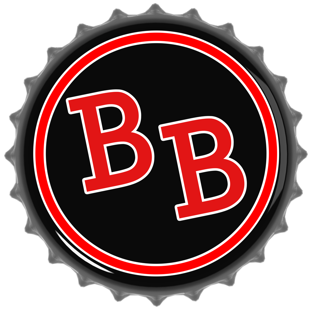
The identity is built around a single strong idea: the top of a black 3D-modeled bottle cap, rendered in KeyShot, with the initials BB at its center. It's immediately readable, specific to the industry, and professional without being generic. The color palette — red, black, and white, with red and white as the primary pairing and black as the dominant — was developed with direct client input and carries through every application.
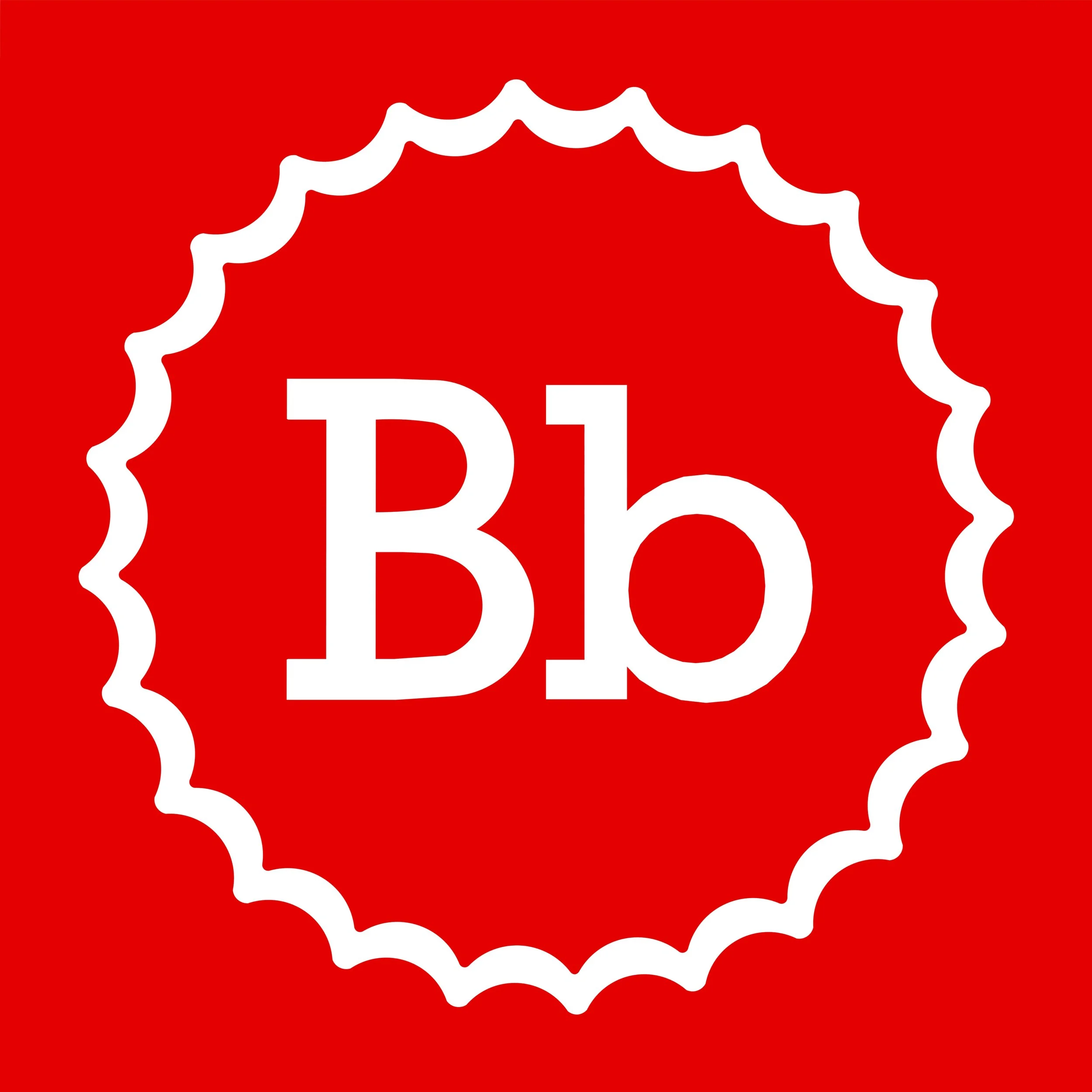
The full logo system includes a stacked combination mark, an inline combination mark, a simplified minimalist variant (the cap outline and Bb in white on a red field), and a wordmark.
Logo
Combination Mark - Stacked
Simplified/Minimalist Logo
Combination Mark - Inline

Wordmark
Brand Identity
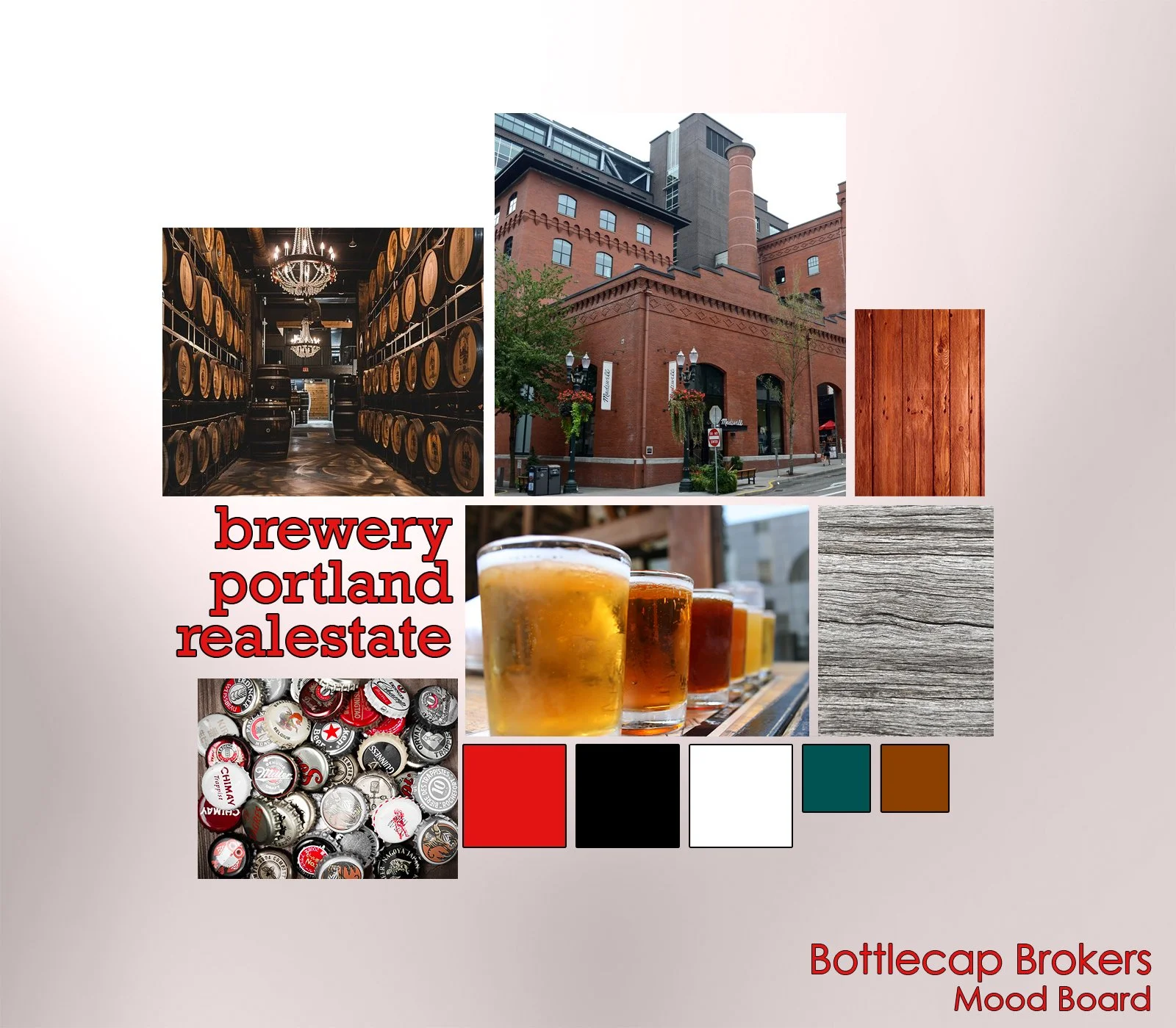
The moodboard established the visual and tonal direction — the balance point between Portland and the Pacific Northwest and craft beer culture that the whole brand needed to hold.
The presskit formalizes that identity into a designed presentation document: title, company overview, services, brand standards (color palette and typography), client testimonials and highlights, and contact information. As a deliverable it does double duty — a practical business tool and a demonstration of the brand system working at full extension.
Mood Board
Presskit
Marketing Materials
The business card is the brand at its most reduced. The front carries the minimalist logo — bottle cap outline and Bb, no box, no color fill, just the mark. The back is a clean contact layout. Red ink on white throughout. It's a small thing that holds up.

Business Card - Front

Business Card - Back
Project Details
Web Design · Brand Identity · Logo Design · Print & Marketing Materials
Role
Software
SketchUp · KeyShot · Photoshop · Illustrator · Canva
Logo System · Website Mockups · Moodboard · Presskit · Business Card
Deliverables