Project Overview
This is a self-initiated concept project — an opportunity to work through the complete brand development process from identity system to physical product to experiential design, without the constraints of a live brief. The subject is Cascadia Oak Distillery, a fictional small-batch single malt whiskey maker rooted in Sisters, Oregon and the Cascade Mountains.
The through-line is the landscape itself: the Oregon White Oak, the Three Sisters, the Pacific Northwest light and terrain. Every design decision traces back to that source material, translated into a visual language that needed to feel premium without feeling precious. The typeface chosen throughout — Oregon font — was selected for exactly that reason. It has a frontier quality to it, refined but rough around the edges in a way that feels less like a historical reference and more like a place. Timeless in the sense that the Cascades are timeless, not in the sense of a black tuxedo.
Brand Identity
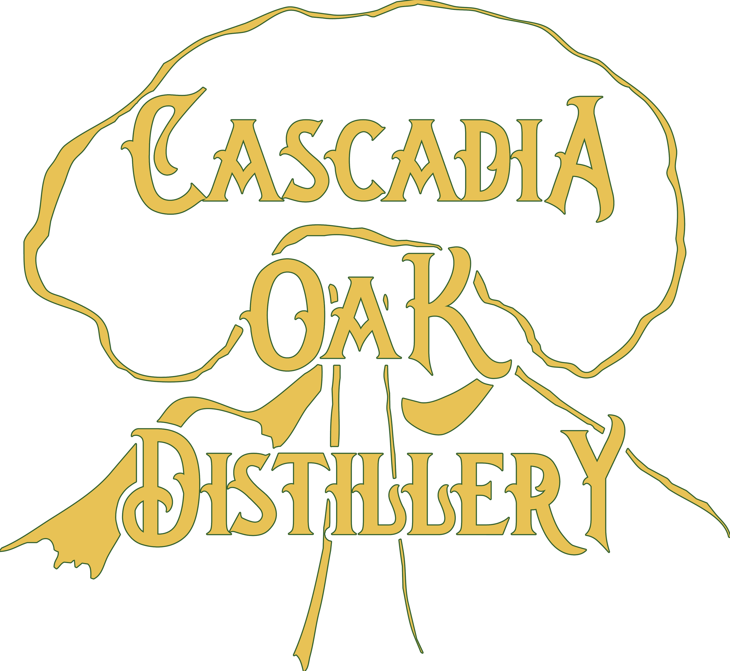
The identity system starts with the logo — a minimalist outline of an Oregon White Oak profile with the silhouette of the Three Sisters range behind it. Clean, specific, and rooted in place without being literal about it. From there the system extends through a special release logomark variant, a wordmark, a mood board, and a full style guide establishing the visual language for everything that follows.
Logo

Logomark - Special Release Variant

Wordmark
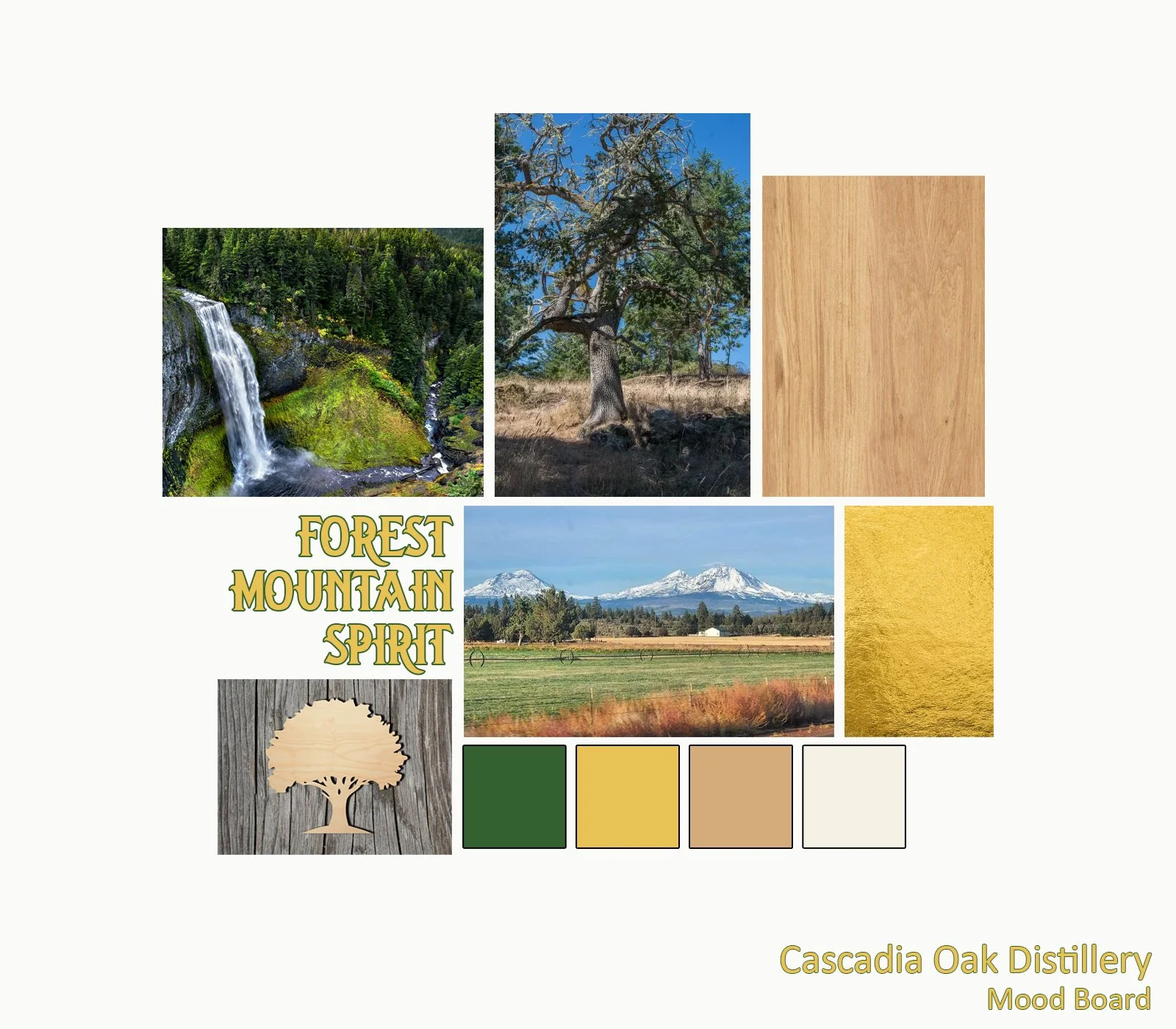
Mood Board
Style Guide
Market Presence
The print ad was designed as a deliberate period reference — inspired by Macallan advertising from the 1960s, that particular combination of bold typography, atmospheric landscape, and restrained product placement. The background is a four-toned Pacific Northwest tableau: canyon walls, waterfalls, layered forest, and a golden sun that pulls the eye downward through the composition to the bottle anchored in the lower right. That through-line — tagline at the top, landscape as the journey, product as the destination — is the structural logic the whole piece is built around.
The bottle itself was designed and modeled in KeyShot, placed at the edge of the frame rather than centered, which keeps it feeling editorial rather than catalog. The tagline — Find Your Spirit — was chosen to work on both levels without laboring the point.
The tasting menu extends the brand's typographic and layout system into a functional piece designed to support the full brand experience at point of contact.
The tasting menu extends the brand's typographic and layout system into a functional piece designed to support the full brand experience at point of contact.
Product Design
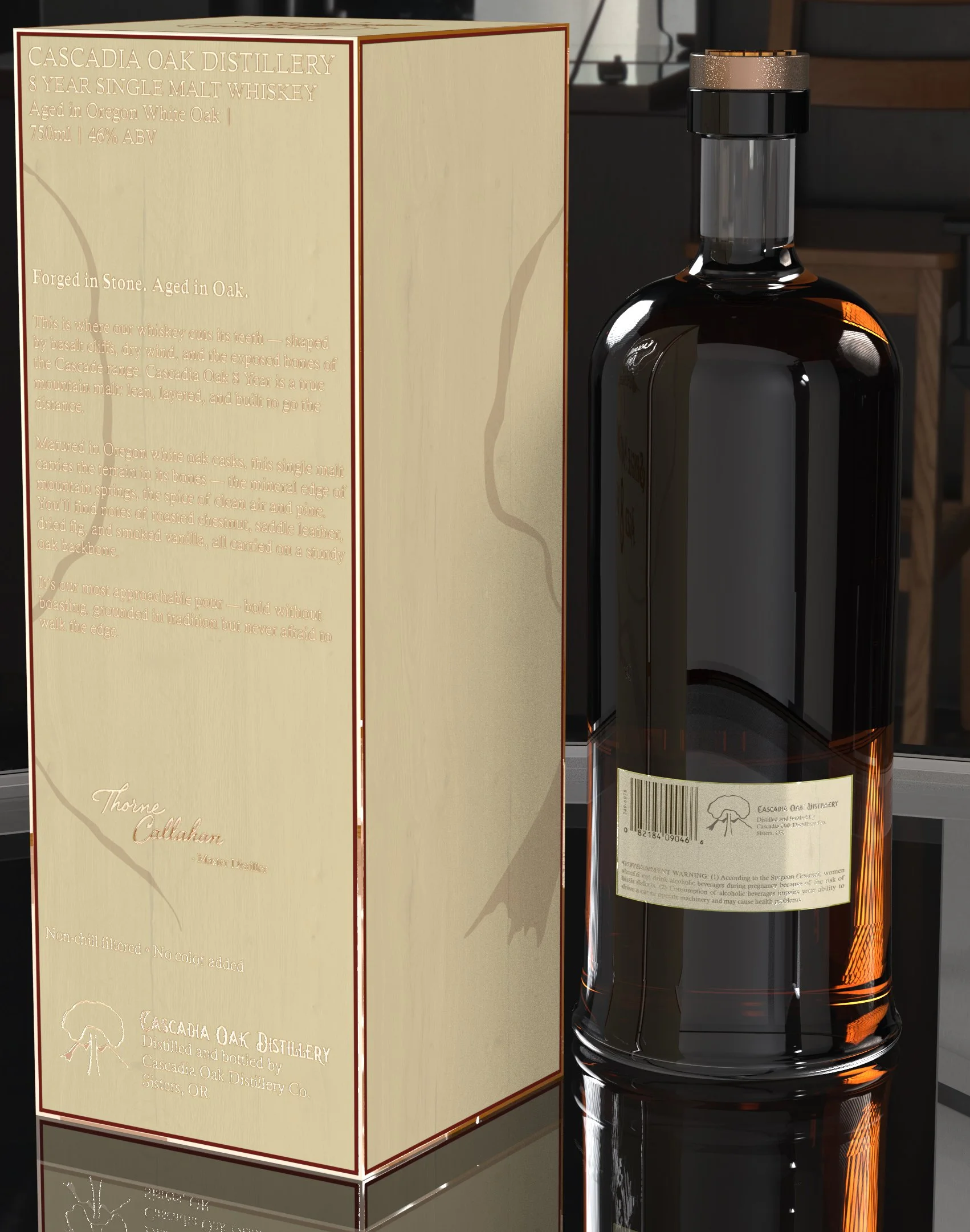
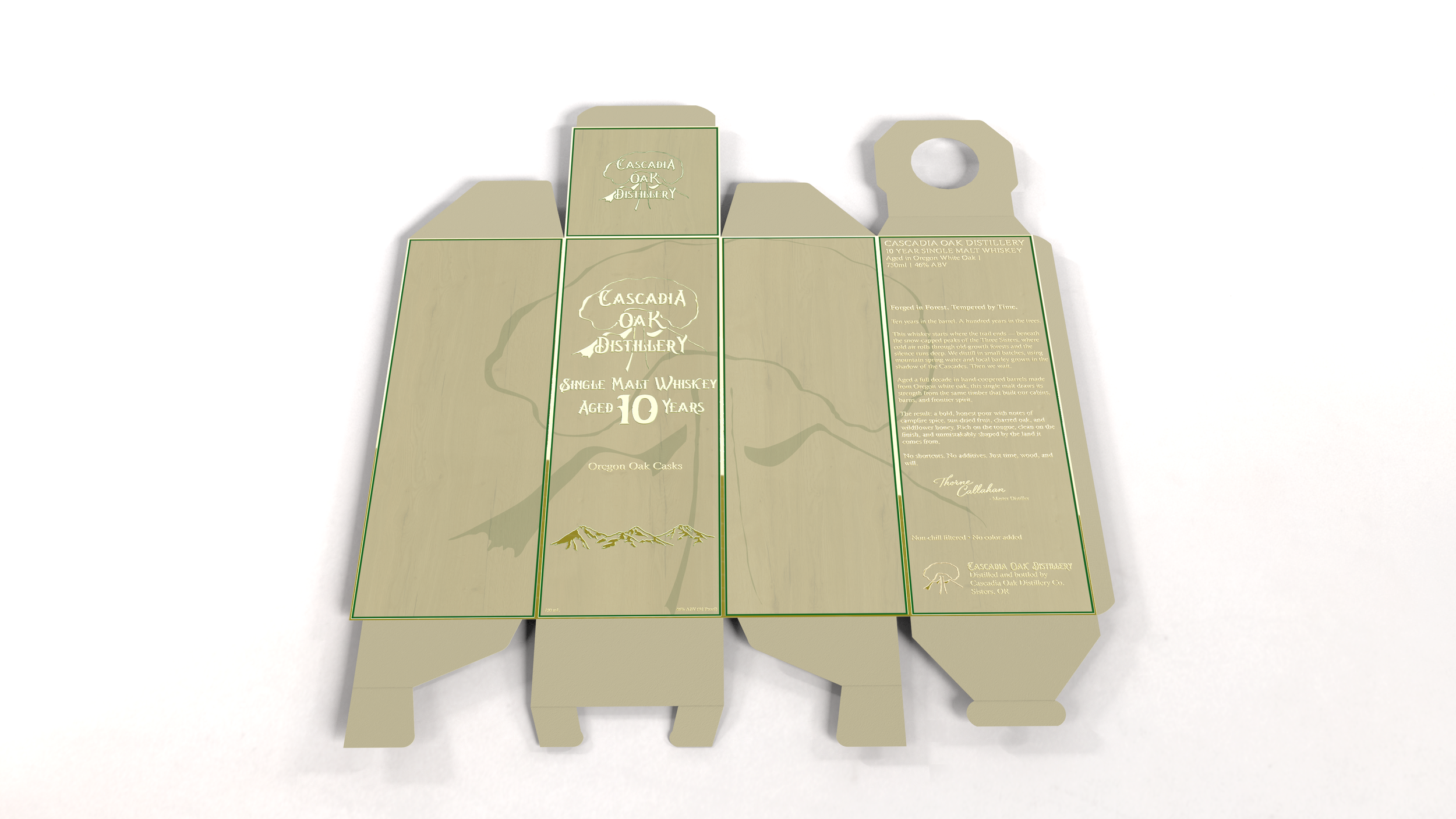
Three expressions rendered in KeyShot in a studio composition: the flagship 10-year, an 8-year, and the White Oak Collection specialty release. Each presented with its box, and shown across multiple views including a packaging flat demonstrating construction and print intent.
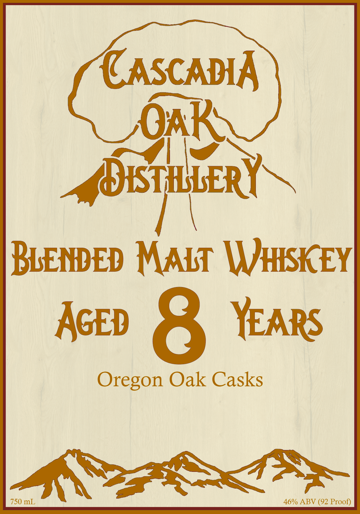
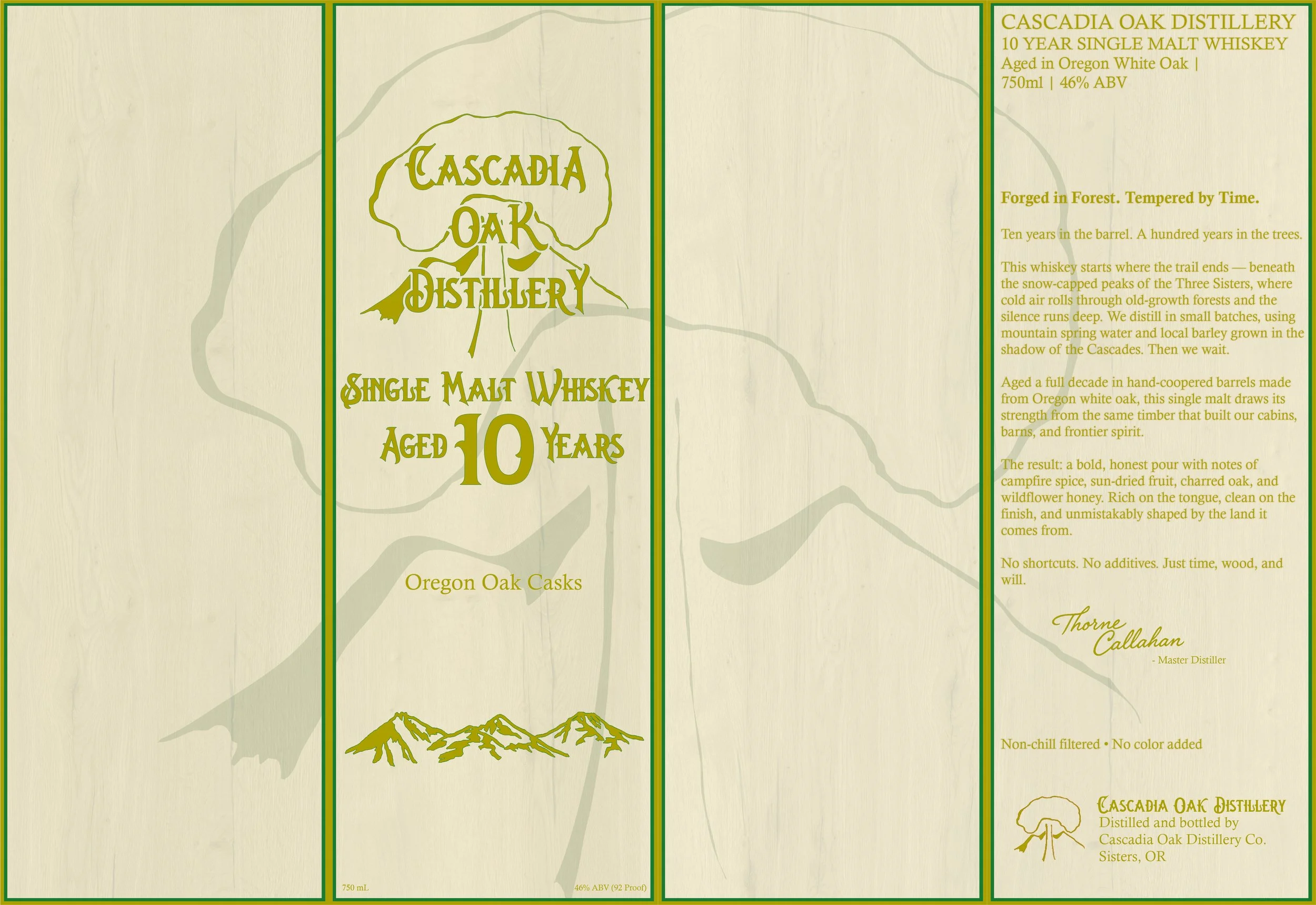
A simple round form with a slight concave in the lower half — a detail as much about grip and handling as visual character. The label is cream with gold lettering and forest green accents: the logo and age statement in Oregon font, "Oregon Oak Casks" in a secondary font below, and a silhouette of the Three Sisters running along the bottom edge. The same typeface carries through every application at every scale — a deliberate consistency that asks the roughness to read as character rather than accident.


The box mirrors the label's color system with the addition of a watermarked oak tree profile behind the primary typography — a detail that rewards closer inspection without competing for attention. The back was designed as a complete product story: a secondary tagline, narrative copy rooting the whiskey in its landscape and process, tasting notes, a master distiller signature, and production credentials that signal authenticity to a whiskey-literate audience. The thinking behind the label carries all the way through to the fine print.


Visual Storytelling
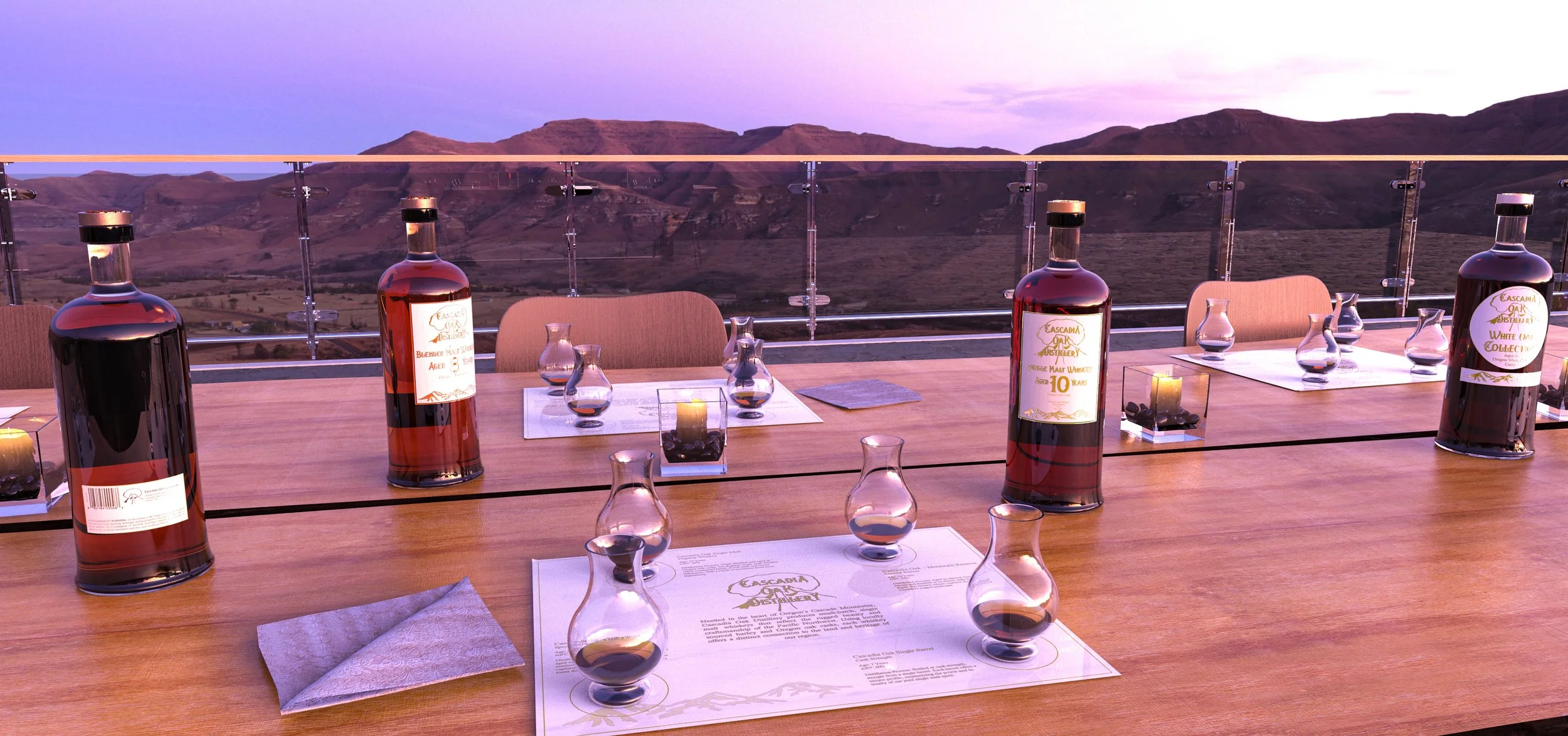
A single photorealistic render — an outdoor tasting at magic hour, the Three Sisters visible in the distance near Bend, the tasting menu and snifter glasses on the table alongside the bottles. The brief for this image was essentially: put the brand in its landscape and let the two validate each other.
Experiential Design
Cascadia Oak Distillery – Pop-Up Brand Experience
“Crafted in Light. Rooted in Oak.”
The pop-up booth was designed to distill the brand into a minimal footprint suitable for a trade or festival environment. A glowing white marble tasting counter with translucent green top anchors the space, backed by illuminated product displays, oak shelving, and a central screen for branded video content. Backlit lettering, ivy, and green-gold marble details bring the Pacific Northwest sensibility into an interior context — the goal being a space that feels like Cascadia Oak whether it's in Portland or somewhere considerably further from Oregon.
Dimension Diagrams

Project Details
Brand Identity · Packaging Design · Product Modeling · Environmental Design · Visual Storytelling
Role
Software
SketchUp · AutoCAD · KeyShot · Photoshop · Illustrator
Logo System · Style Guide · Print Advertising · Tasting Menu · Bottle & Packaging · Product Renders · Experiential Design
Deliverables