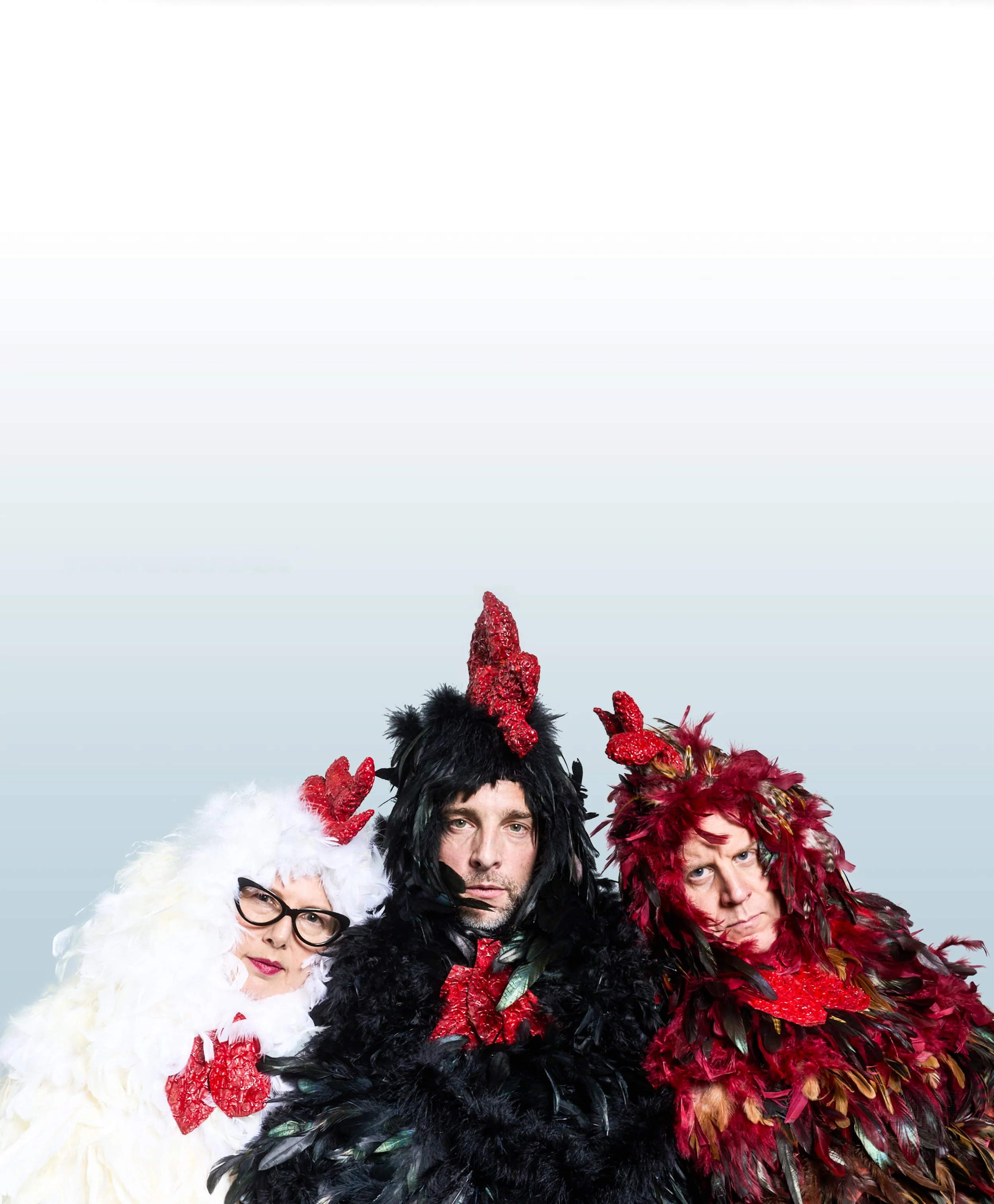


Three Chickens Confront Existence is a darkly comedic play about three factory-farmed broiler chickens — a cynical pragmatist, an incurable optimist, and a mathematician fixated on calculating the exact date of their slaughter — confined in a cage and passing the time debating philosophy, mortality, and the human condition. Acclaimed at its New York debut and across two sold-out Edinburgh Fringe runs, it's exactly the kind of project that makes design interesting: a strong, strange concept that needs visual work capable of holding its own.
I was brought on for the New York premiere and hired again for both Edinburgh runs — developing key art, illustration, type treatments, and promotional materials across formats and scales, from print collateral to large-format outdoor installations coordinated directly with the festival's principal vendor.
Every format shared the same governing idea: the humor comes from playing the absurdity completely straight, so the visual work always had to hold real weight rather than wink at the joke. That meant the key art was less about illustrating a punchline and more about finding the single image or composition that made three chickens debating mortality feel entirely serious.
Project Overview

NYC - Debut
I was originally hired for a four-show blackbox run early that summer, staged with Naked Angels Theater Company months ahead of the show's August Fringe debut. The run wasn't just a premiere, it was the engine meant to generate buzz and raise the funds and interest needed to get the production to Edinburgh. That gave the key art a job beyond introducing the play: it had to work hard enough, in a handful of performances, to convince people the show was worth backing.
With no photography to work from and no prior visual identity to build on, the challenge started earlier than in later versions: finding an image that could hold the show's absurdist premise and its genuine philosophical weight at the same time, without tipping toward parody on one side or losing the humor on the other.
The final illustration places the three chickens staring out into the void of space, a single blue feather adrift in the distance, a detail significant to the play itself. It's a quieter image than the photographic key art that followed, but it's built on the same idea that carried through every version after it: play the absurdity completely straight, and let the weight of the question, mortality, meaning, the vastness of it, do the work instead of a punchline.
Edinburgh Fringe Fest - 2024
First Hire
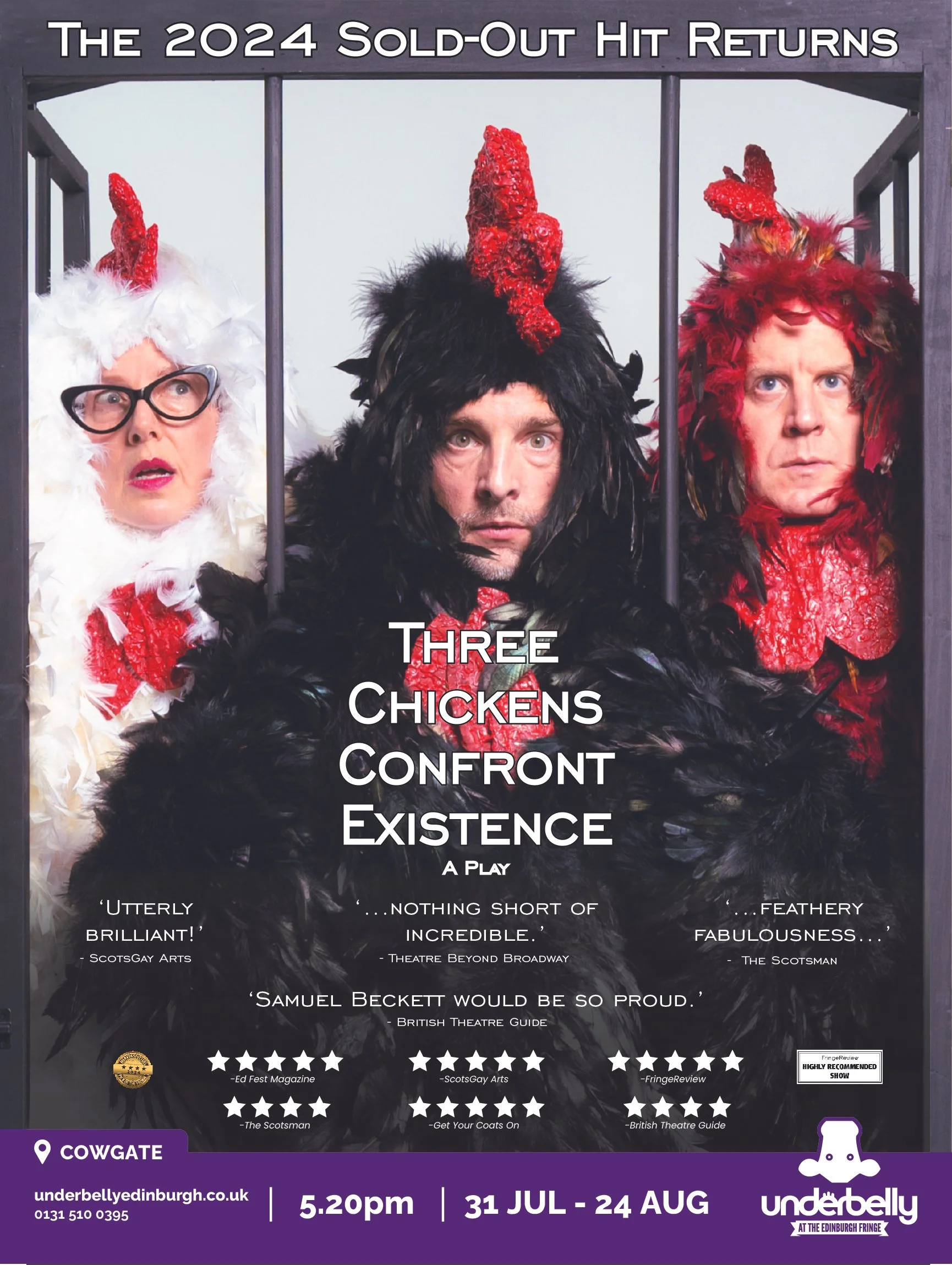
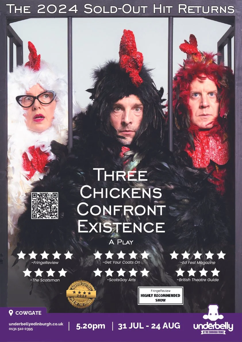
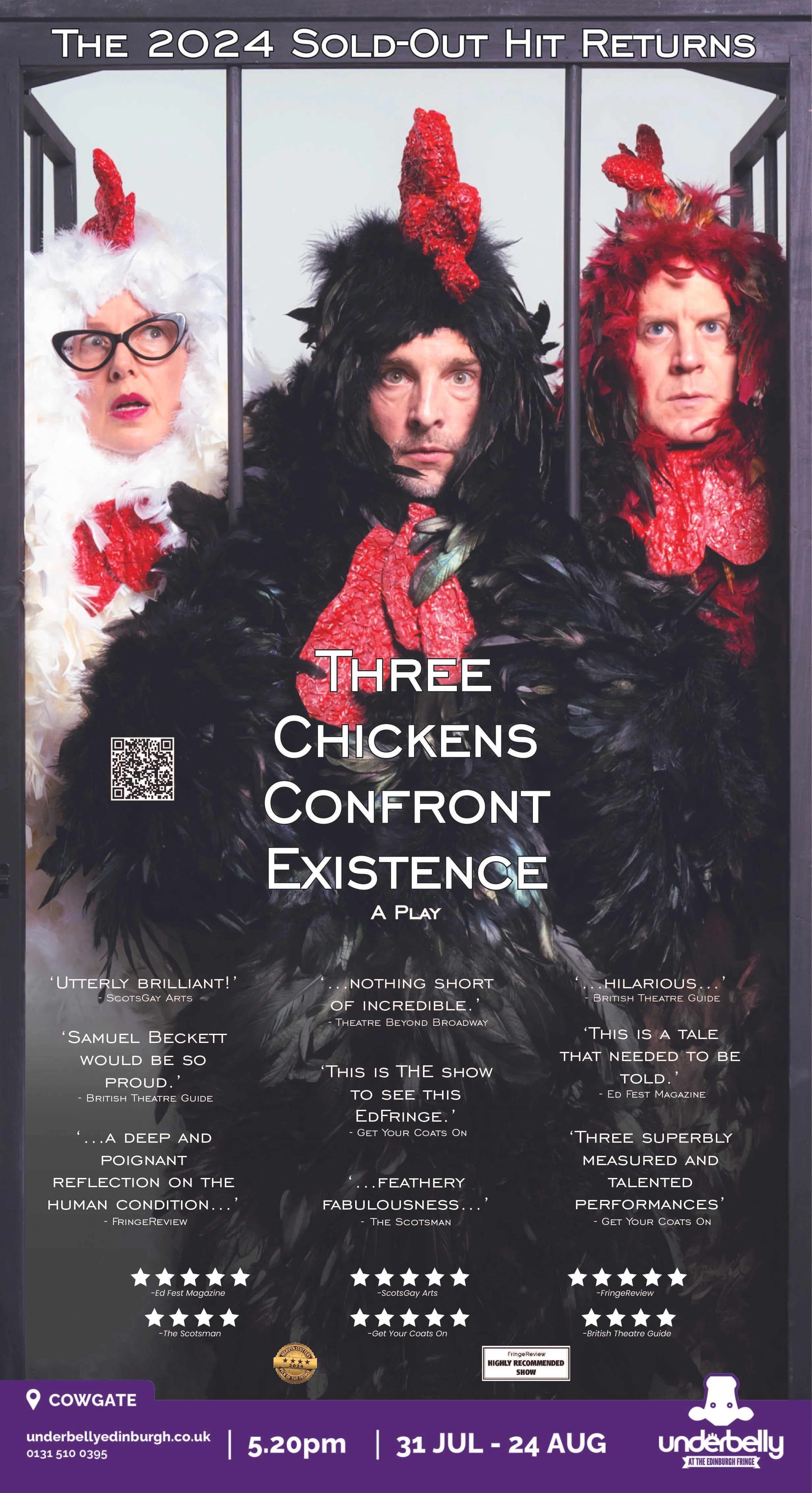
The Edinburgh campaign marked a shift from illustrated to photographic key art. The producer sent over 30 shots from a cast wardrobe shoot, and the job was to find the one image that could anchor an entire visual identity. That meant looking past which shot was best lit or best composed and asking which one captured the show's tone without any of the actors breaking character, since a single knowing glance at the camera would have undercut the whole premise.
The image that worked best wasn't shot for use as key art. It was framed from above and to the side, angled away from the cage that anchors the show's set. Squaring up the perspective while keeping the shot's realism intact, rather than making it look visibly corrected, took as much care as the selection itself; anything that read as manipulated would have broken the same straight-faced tone the image was chosen for.
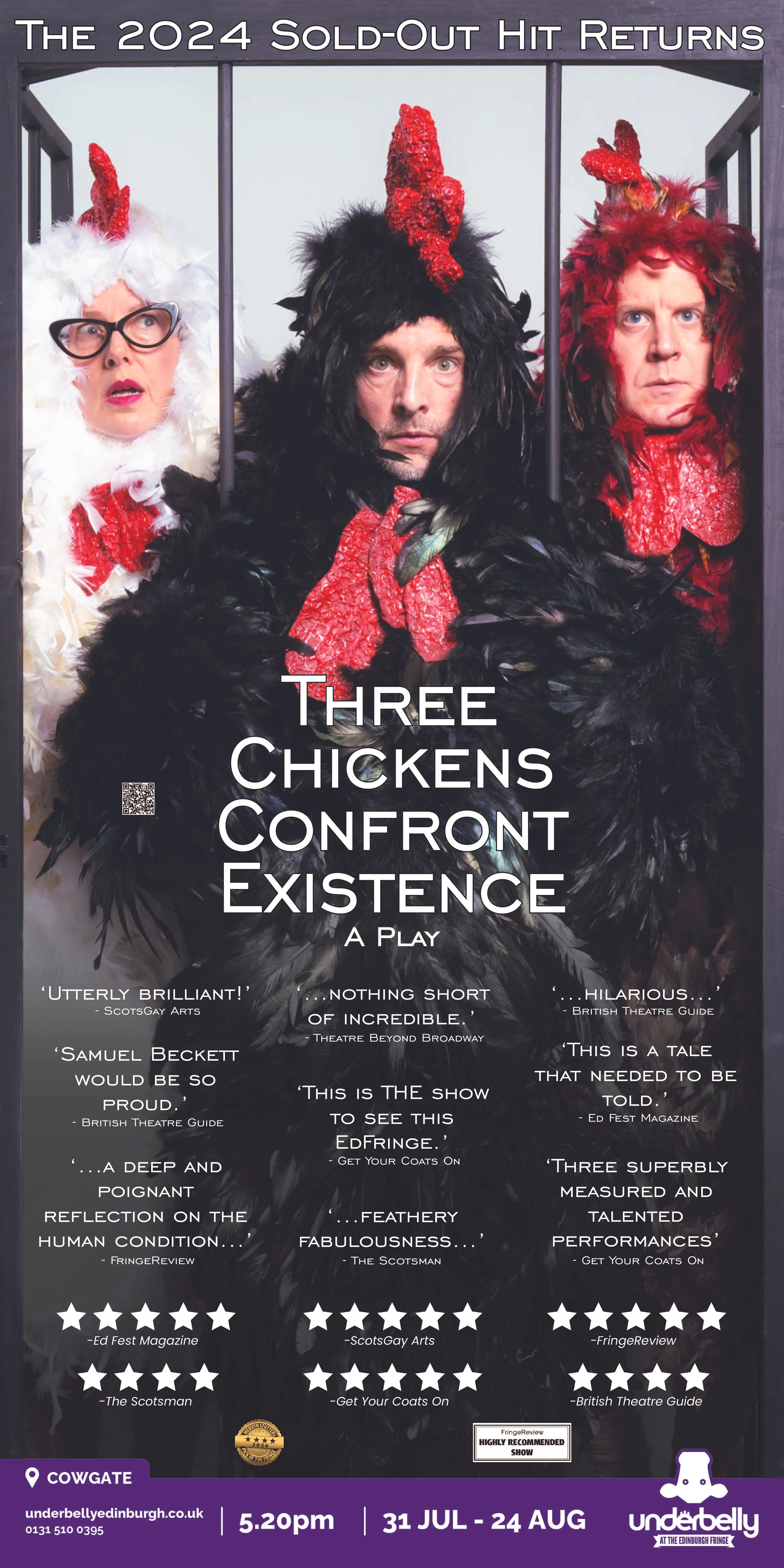
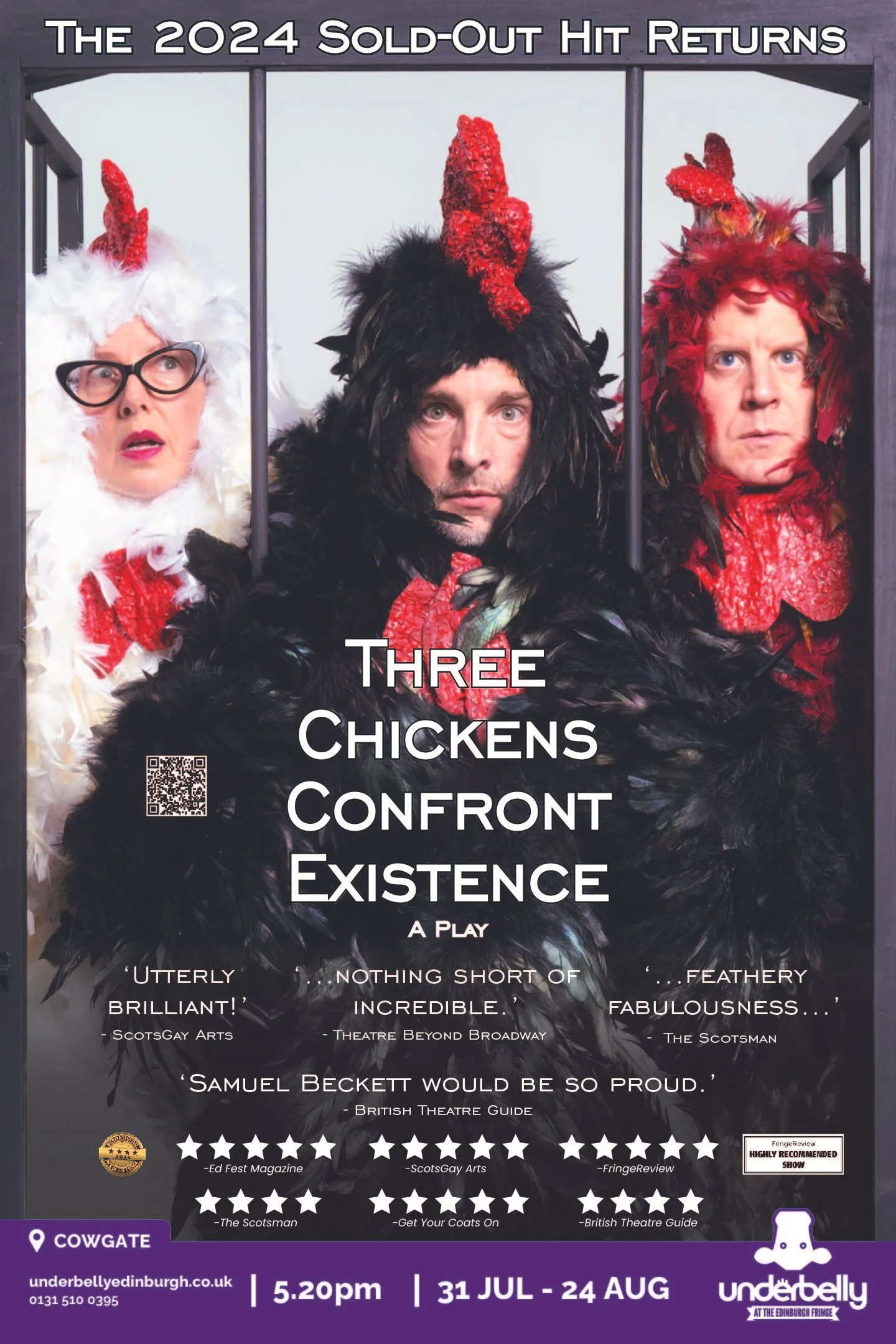
From there, the campaign built outward: a typeface chosen after several rounds of testing against the image, a layout built for legibility at outdoor scale, and adaptation across formats and multiple Fringe venues. Coordinating print specifications directly with the festival's principal vendor was as much a part of the work as the design itself.
That coordination produced a full set of format executions across the vendor's available inventory, each adapted from the hero key art to fit that format's physical specifications, from the tall, narrow crop needed for a lamppost wrap to the more compact composition of a bollard wrap. Because the producer was new to the festival and purchased late, 2024's format selection was limited to whatever inventory remained, resulting in a smaller set of executions than the campaign would eventually support.
Executions on Site


The Scotsman, Scotland's premier national newspaper, featured the production in a full-page arts section spread as part of its 2024 Fringe coverage.
Edinburgh Fringe Fest - 2025
Rehire
Being rehired for a second year wasn't a reason to revisit the key art, it was confirmation the original had already done its job. The tone was set, the identity was working, and 2025's task was extension rather than reinvention.
With a full year of inventory to plan against and no need to wait on late availability, the producer purchased across a far wider range of the vendor's formats for 2025. The format executions grew to match, bollard wraps, lamppost wraps, tower posters, and additional outdoor sites across the city, each adapted from the same hero key art that had already proven itself the year before.
That key art traveled further than the campaign itself. Out of Hand, the vendor handling all outdoor advertising for the festival, used the 2024 bollard installation as backdrop imagery across their 2025 Outdoor Media Guide, and separately applied the image to internal product packaging, incidental signs that the work had staying power beyond its original run.


Project Details
Concept Development · Illustration · Typography · Photo Editing · Layout · Production Prep
Role
Software
Photoshop · Illustrator · SketchUp · KeyShot
Key Art · Print Collateral · Large-Format Outdoor · Multi-Site Layout Adaptation
Deliverables