

Three Chickens Confront Existence is a darkly comedic play about three factory-farmed broiler chickens — a cynical pragmatist, an incurable optimist, and a mathematician fixated on calculating the exact date of their slaughter — confined in a cage and passing the time debating philosophy, mortality, and the human condition. Acclaimed at its New York debut and across two sold-out Edinburgh Fringe runs, it's exactly the kind of project that makes design interesting: a strong, strange concept that needs visual work capable of holding its own.
I was brought on for the New York premiere and hired again for both Edinburgh runs — developing key art, illustration, type treatments, and promotional materials across formats and scales, from print collateral to large-format outdoor installations coordinated directly with the festival's principal vendor.
Project Overview

Edinburgh Fringe Fest - 2025
The 2025 campaign built on the photographic direction established the previous year, extending and adapting the key art across the full range of Fringe promotional formats and outdoor sites. A measure of how the 2024 work landed: the campaign materials were featured in Out of Hand's Outdoor Media Advertising Guide for 2025 as an example of effective outdoor design.
Photo-based key art design, transformation, layout, and format adaptation for multi-site promotional use
Artwork from the 2024 Edinburgh run was featured in Out of Hand’s Outdoor Media Advertising Guide for the 2025 Fringe Festival, highlighting it as an example of effective outdoor design
Edinburgh Fringe Fest - 2024
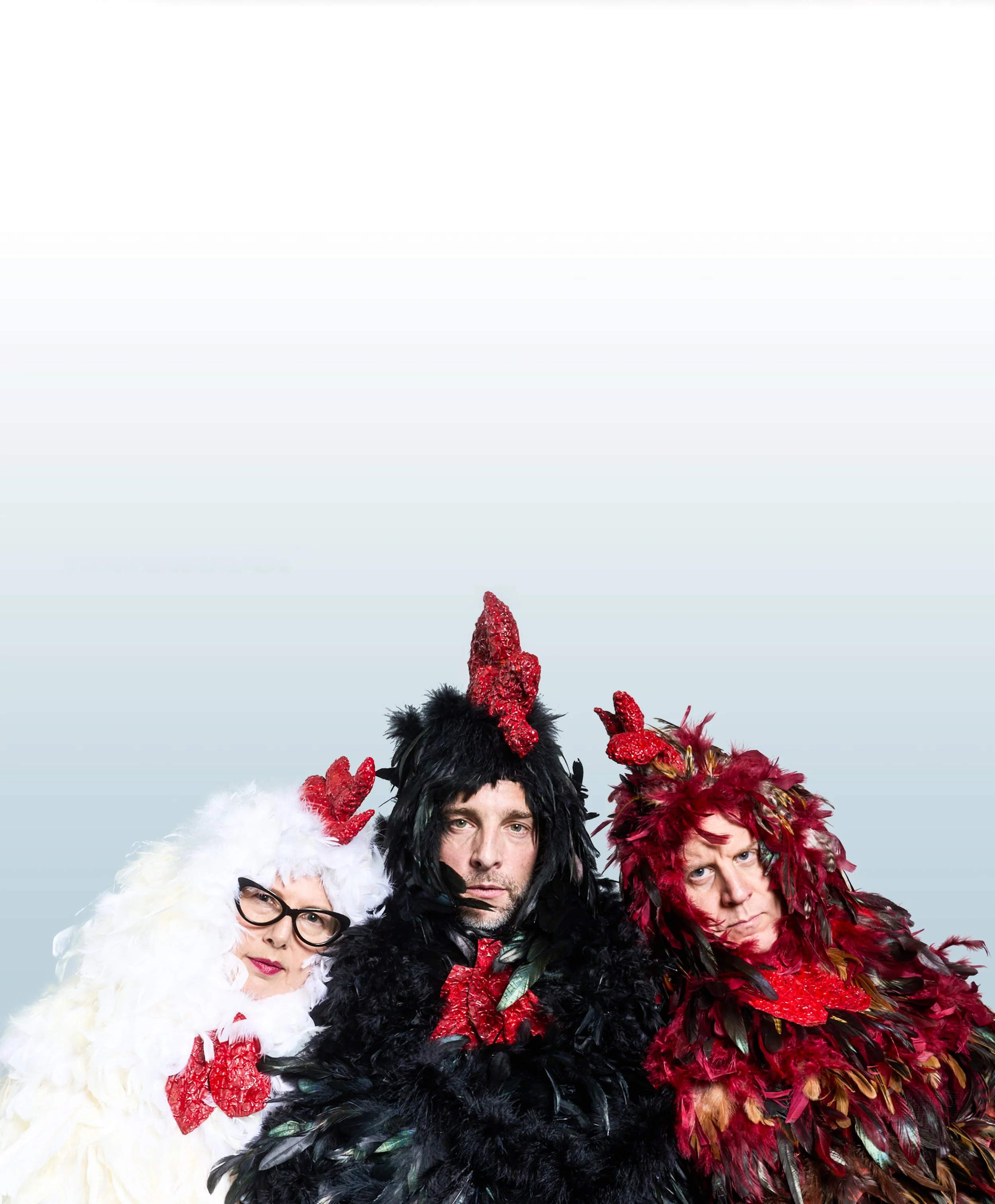
The Edinburgh campaign marked a shift from illustrated to photographic key art. Working from a cast wardrobe shoot, I selected the hero image that would anchor the new visual identity — then built the campaign outward from that choice, adapting key art across outdoor media formats and multiple Fringe venues. Coordinating print specifications directly with the festival's principal vendor was as much a part of the work as the design itself.
Photo-based key art design, transformation, layout, and format adaptation for multi-site promotional use
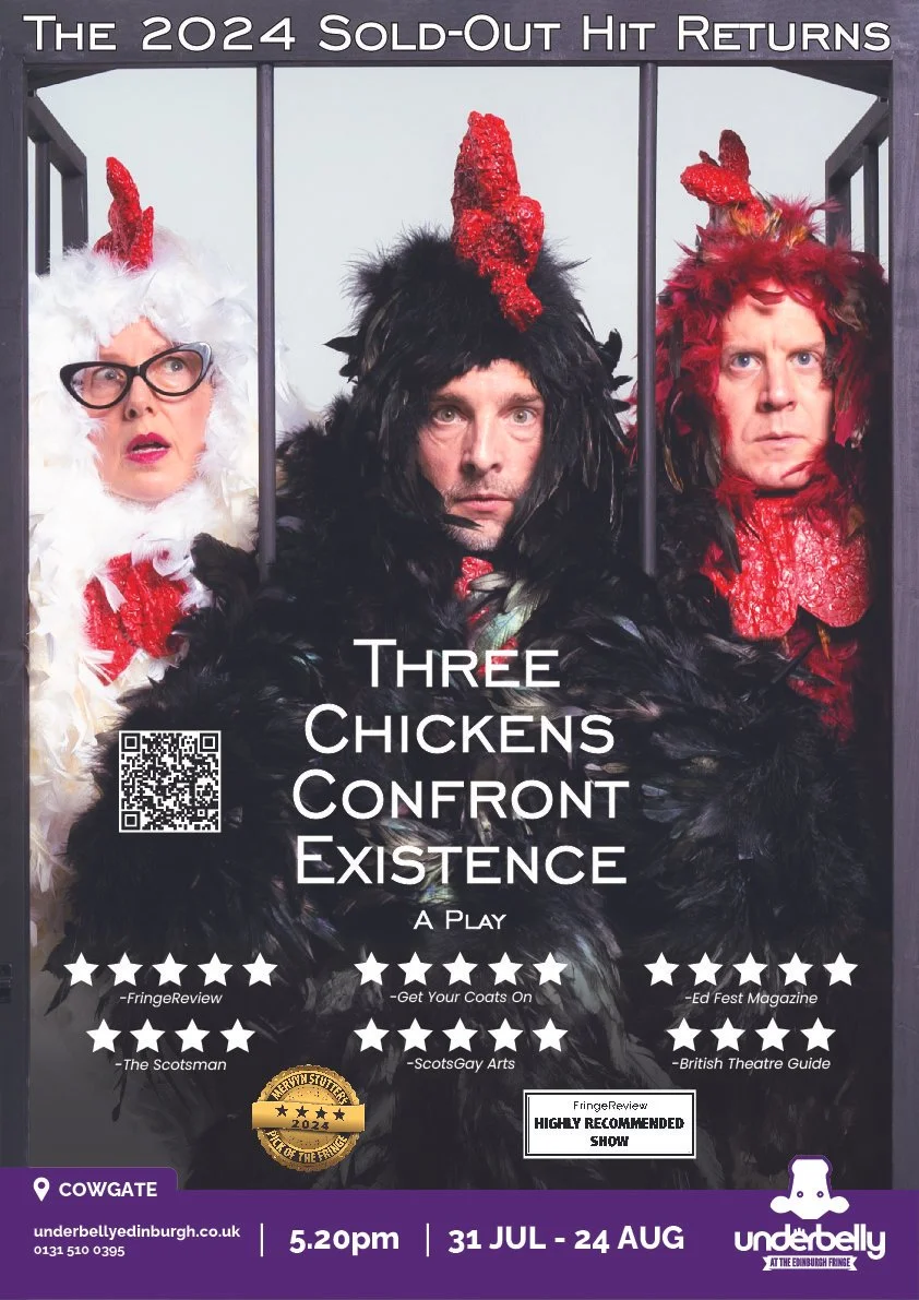
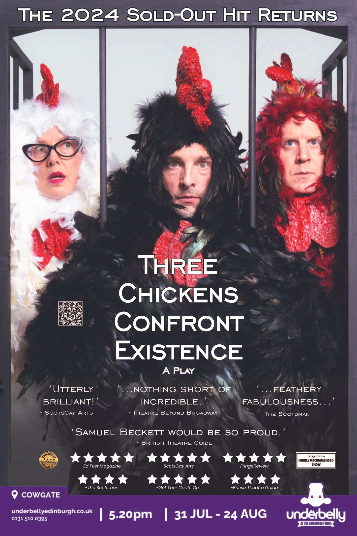
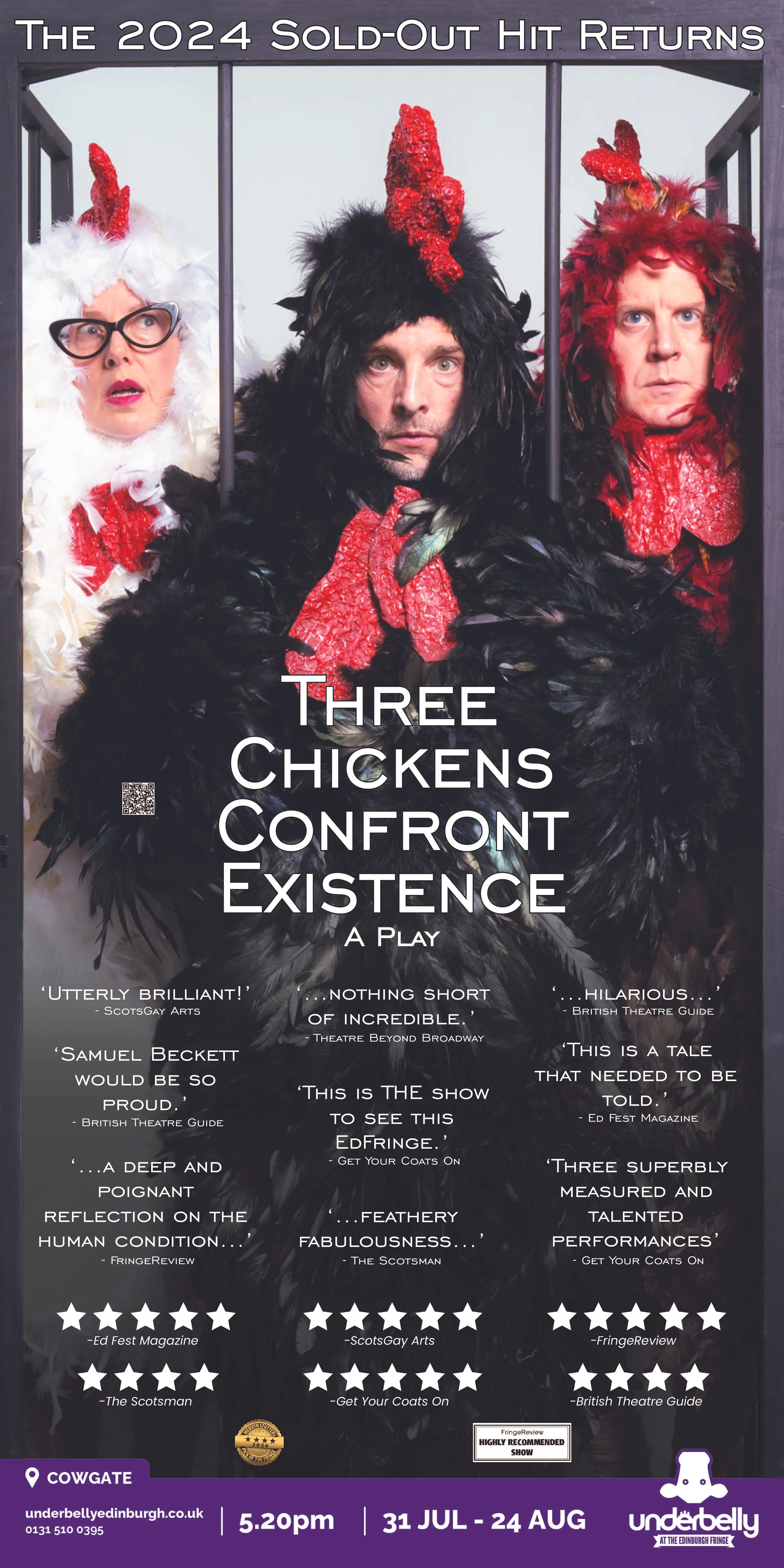
Key art in Edinburgh


Key art featured in Edinburgh’s Scotsman newspaper
NYC - Debut
The original campaign was built from scratch — concept, illustration, type treatment, and collateral — developed for the premiere run with Naked Angels Theater Company. The challenge was finding a visual language that could hold the show's absurdist premise and its genuine philosophical weight at the same time.
Original illustrated key art, type treatment, and collateral design for the New York premiere.

Project Details
Concept Development · Illustration · Typography · Photo Editing · Layout · Production Prep
Role
Software
Photoshop · Illustrator · SketchUp · KeyShot
Key Art · Print Collateral · Large-Format Outdoor · Multi-Site Layout Adaptation
Deliverables